

Our valued sponsor

You are using an out of date browser. It may not display this or other websites correctly.
You should upgrade or use an alternative browser.
You should upgrade or use an alternative browser.
OffshoreCorpTalk Scheduled Upgrade and Maintenance on September 25th
- Thread starter JohnLocke
- Start date
Sorry, but please try again now.Can't reply with a screenshot. But, from console, it's 403 - forbidden. And, it's intermittent.
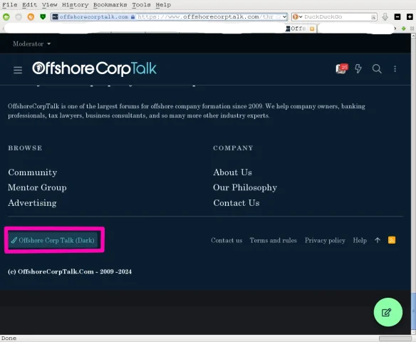
Click on your avatar (top right) => then the avatar icon with settings (3rd from left) . Then click on preferences . Then you should see a style select field . Then select Offshore corp talk (light)hello, can someone help me - i would like to use light color scheme in stead of dark? how can I change? thanks!

Yes, this works in any case. @AndyAresa: In addition, at least on some platforms, there is a button for a quick theme change (Style Chooser) at the left bottom edge of the webpage (see attached screenshot).Click on your avatar (top right) => then the avatar icon with settings (3rd from left) . Then click on preferences . Then you should see a style select field . Then select Offshore corp talk (light)
Attachments
They would need to modify the media queries breakpoints currently set to 900px width . Your iPad is 1024px wide .I switched to an iPad 13” and I don’t see the same navigation bar as on the 11” model:
View attachment 7935
The menu bar on the left and the bolt on the right are missing
This isn't a OS related issue . It's the dimensions of the screen more specific the logical dimensions of the screen and the breakpoints used by their media queries (specific pixel values where the layout shifts , from mobile/tablet/desktop ). Currently this breakpoint is set to 900px for tablets . I would recommend setting it at 1024px for tablets (1024px is the go to nowadays for tablets )Maybe you should do an OS update ?
Last edited:
Thanks for reporting in this thread, it’s important that you do so if you notice any errors. This thread is used to address all the issues and bugs you find, even if I don’t respond right away.
Please continue to report sensitive errors that could harm the forum using the contact form.
https://www.offshorecorptalk.com/misc/contact
Please continue to report sensitive errors that could harm the forum using the contact form.
https://www.offshorecorptalk.com/misc/contact
Os 18 on both
This issue should be fixed now. Please feel free to test it and leave a quick note here if it’s working.This isn't a OS related issue . It's the dimensions of the screen more specific the logical dimensions of the screen and the breakpoints used by their media queries (specific pixel values where the layout shifts , from mobile/tablet/desktop ). Currently this breakpoint is set to 900px for tablets . I would recommend setting it at 1024px for tablets (1024px is the go to nowadays for tablets )
Working perfectly now! Thanks, the developers are goodThis issue should be fixed now. Please feel free to test it and leave a quick note here if it’s working.

We’ve just finished a major overhaul of the server infrastructure. From what we can tell, everything seems to be working as before, but with much better security.
Feel free to test out the features and let us know if you spot any issues. We’re only human, so if you find anything, please report it quickly. Minor issues can be posted here in the thread, but if it’s something serious, use the contact form.
We’d really appreciate your help!
Feel free to test out the features and let us know if you spot any issues. We’re only human, so if you find anything, please report it quickly. Minor issues can be posted here in the thread, but if it’s something serious, use the contact form.
We’d really appreciate your help!
I think
- The merging of posts seems not activated again.
- The messenger no longer shows how full the inbox is.
- The new posts is broken on Chrome on Android
- The help page here seems outdated https://www.offshorecorptalk.com/help/titleladder/
Share:
Latest Threads
-
-
 What to Know About Getting a Checking Account That Does Not Require SSN
- Started by Kim-OTC
- Replies: 0
-
HMRC closing its online filing service 31 March 2026
- Started by aragon
- Replies: 4
-

-
How to Open a Bank Account in Mexico for Residents & Non-Residents
- Started by Kim-OTC
- Replies: 0